B2B anti-detect browser platform

Redesigning a power-user desktop app for growth and retention — and building the UX process, design system, and research habit it had been missing.

Role
Product Designer (cross-functional)
Team
PM, engineers, QA
Tools
Sketch · Abstract · Mixpanel · Miro · UserTesting
−30%
password-reset support requests
~25%
of team accounts adopted the switcher
5
feature workstreams, research-led, end to end
Redesigned profile workspace

My role

Beyond shipping features, I reset how design worked here: I reorganized the UX process, built a lightweight design system to hold the product together, and set up continuous research so decisions came from users rather than opinions. The work below is five of those decisions — led by the two with the clearest measured impact.

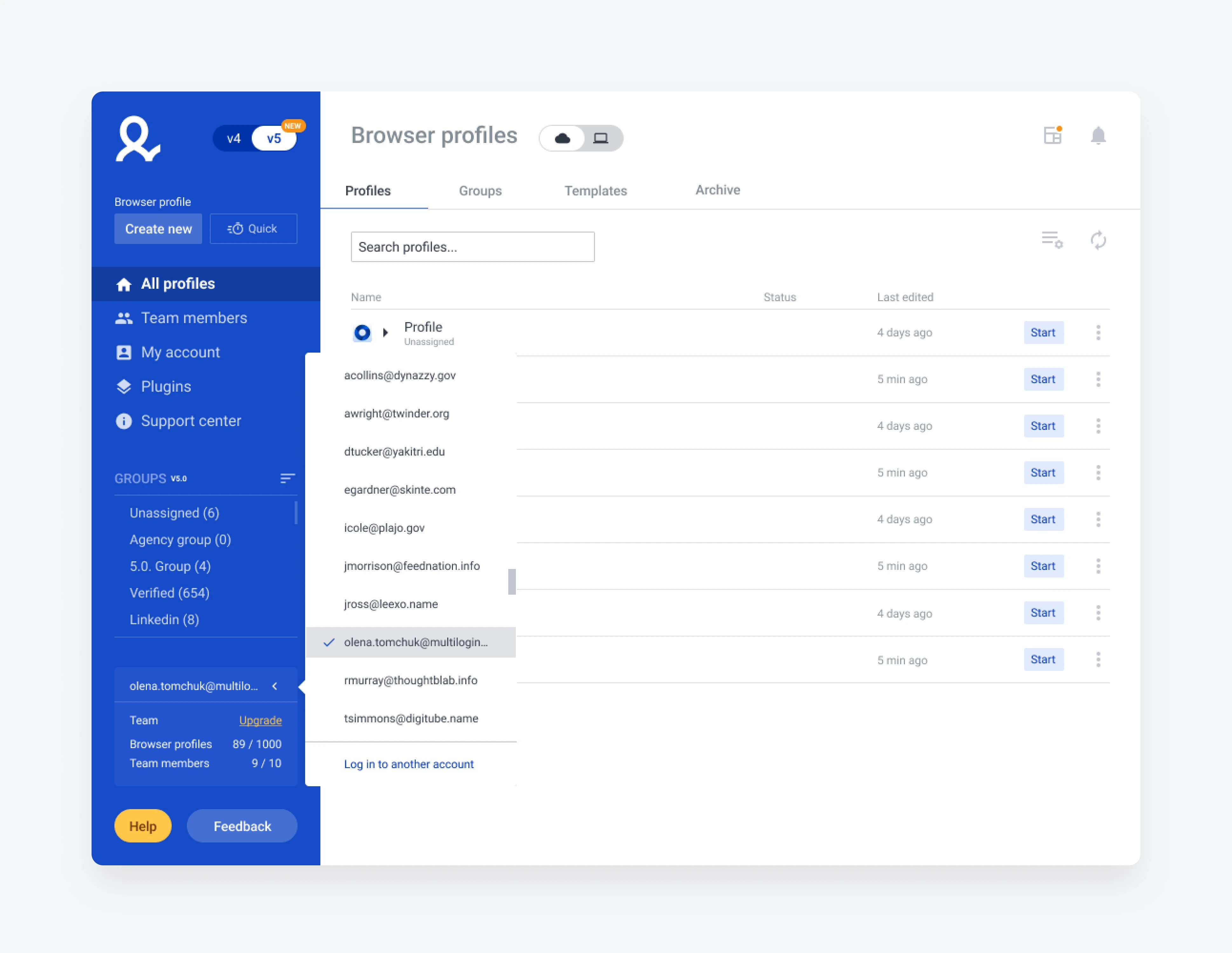
Switching between accounts without logging out

Problem
Continuous research kept surfacing the same friction: users juggle multiple accounts — freelancers across clients, team leads checking their staff — and switching meant logging out and re-entering credentials every time.
Approach
An account switcher that holds several logged-in accounts at once: switch instantly, remove one from the list, add another, or create a new account — all without breaking focus.
Account switcher — switch, add, remove, create
Result Within months, ~25% of team accounts were using the switcher; 37% of all users had two or more accounts active on their machine.

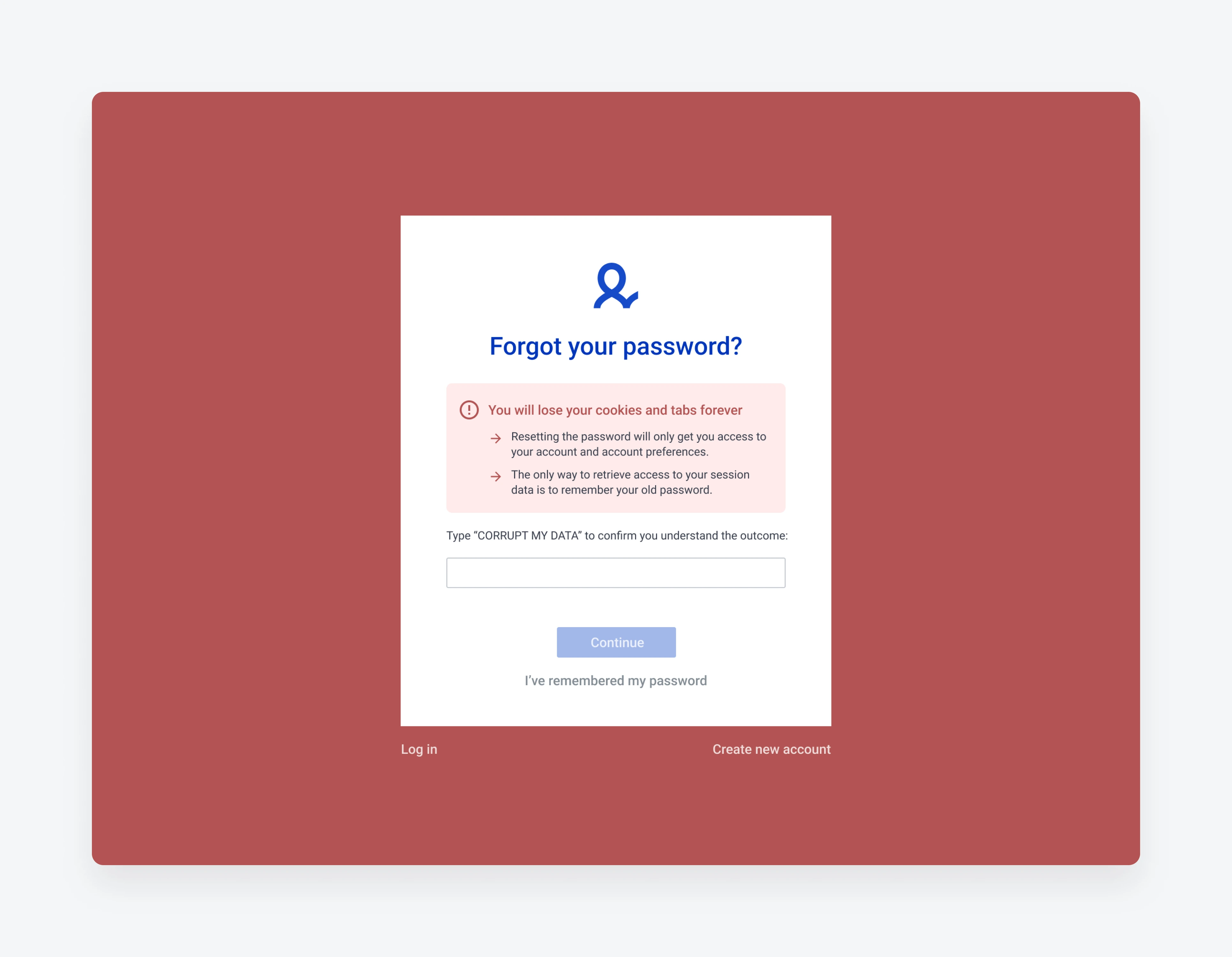
A reset flow that makes the stakes impossible to miss
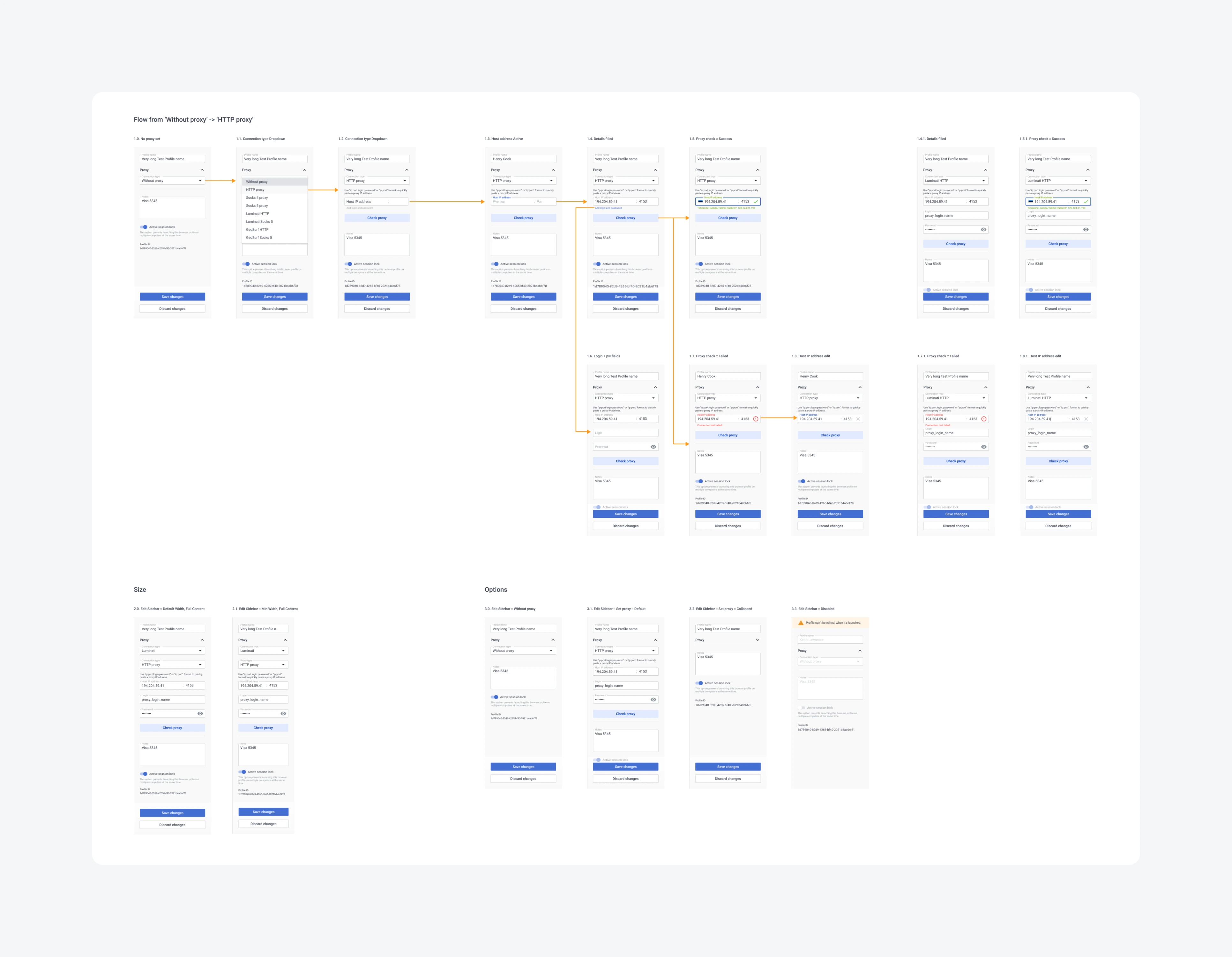
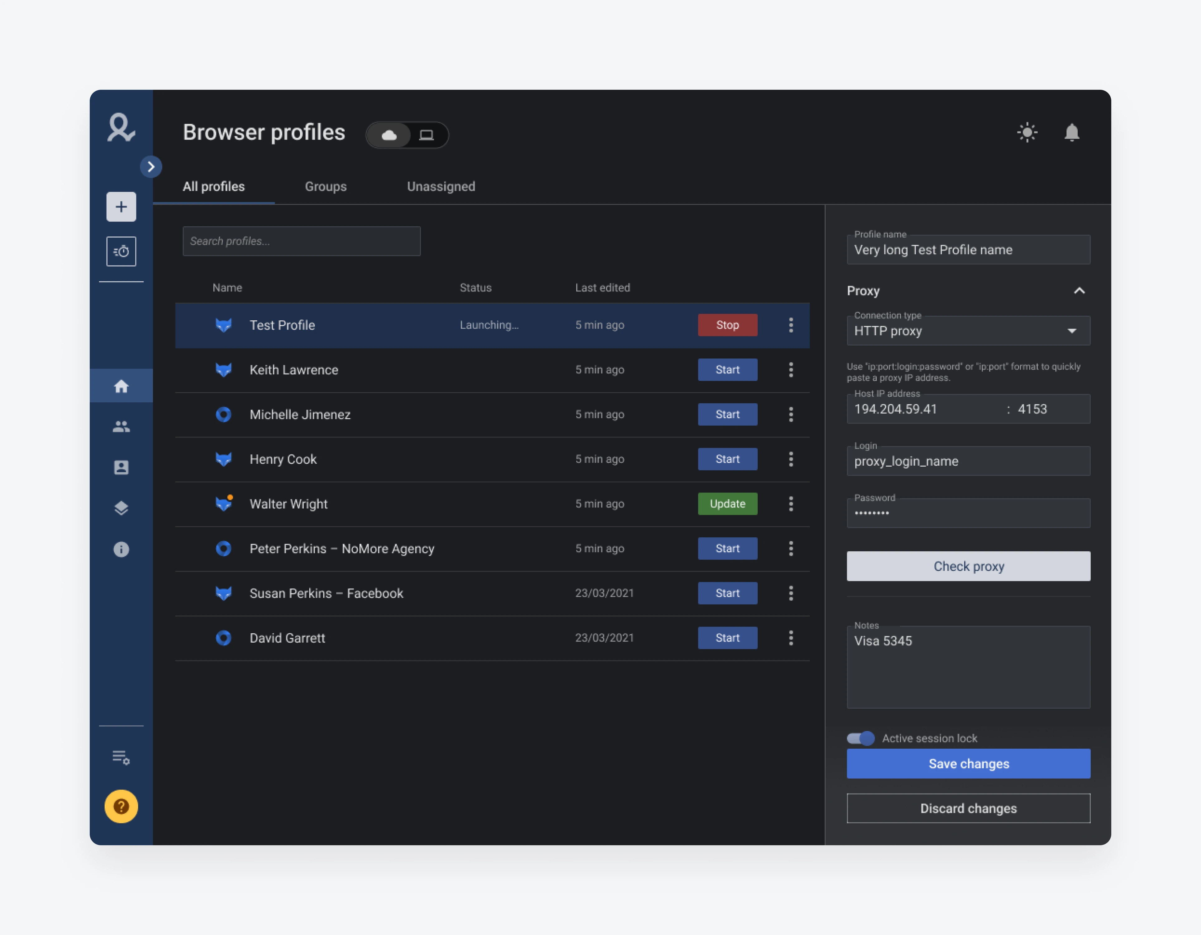
Problem
The password is the encryption key. Resetting it kept the subscription alive but left the user's data unreadable — like keeping your account but losing every photo in it. Users reset reflexively, lost their data, then flooded support trying to recover it.
Insight
Discovery into the journey and the emotions around it showed people reset on autopilot, only realizing the cost afterward — and often remembering their real password once they paused.
Approach
I rebuilt the flow visually and logically, adding a deliberate friction step: to proceed, the user types the phrase “Corrupt my data.” The friction is the point — it forces a pause and makes the consequence concrete.
Reset flow — the Corrupt my data confirmation step
Result Password-reset requests dropped ~30% — fewer destroyed accounts, less support load.

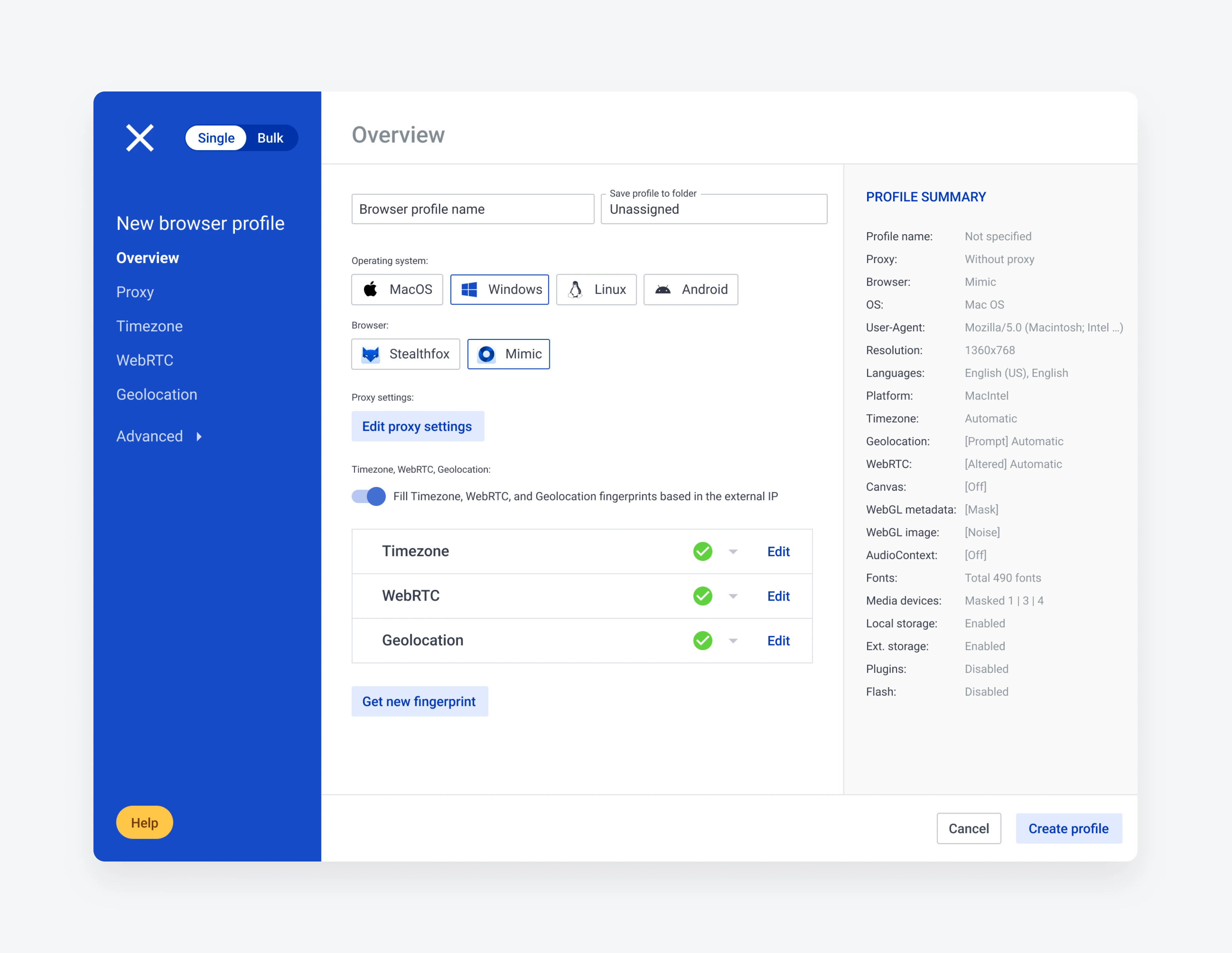
Designing and shipping dark mode

A dark theme for the desktop app that stayed accessible and consistent with the existing light design. The real work was in the constraints: applying contrast and accessibility principles properly, and reconciling the gaps between what design specified and what the code actually did. The result gave users a comfortable experience in low-light environments.

Dark mode — accessible and consistent with the light theme

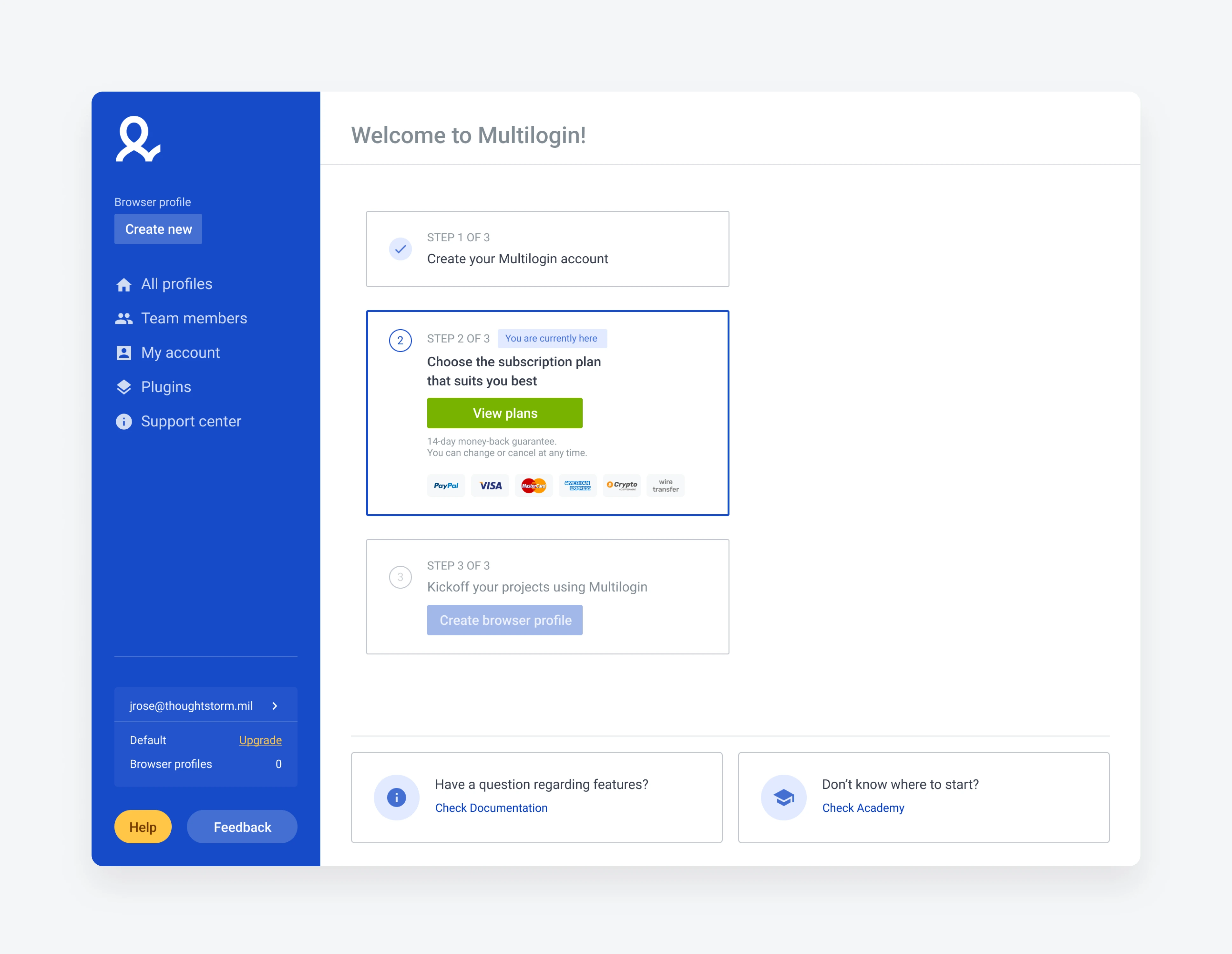
Welcome page for activation

A focused redesign of the Welcome page aimed at lifting the registered-to-paid conversion ratio — guiding new users toward the first action that demonstrates the product's value.

Welcome page — registered-to-paid activation

What carried over

The two results that mattered most — the switcher's adoption and the 30% drop in resets — both came from research, not from a redesign brief. The durable win wasn't any single screen; it was leaving behind a design system and a continuous-research habit the team kept using after I'd moved on.